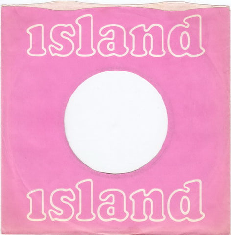
Record collecting isn't all about the actual records for me, I've had a lifelong fascination with the record company sleeves for 7" singles. Don't laugh, it's true.
I know this is supreme nerding, but they have always fascinated me from an early age when my parents would bring home the new Beatles single. I loved the green Parlophone sleeve (it had only been green since 1963) and quickly noticed that they were almost all different from each other. A different logo on the front, then different coloured writing, then a change to a green band on white...on and on it went. Some had a straight edge, some a wavey one. Time and again I read the ad for 'Emitex' on the back, then for Big M lipstick, and from 1965 to 1966, they came with a comic strip on the back detailing the adventures of Fran the Fan. Even now, all the variations of sleeve are the subject of detailed discussion.
If you want to know everything there is to know about Parlophone sleeves, this link is your friend http://45-sleeves.com/UK/parlophone/parl-uk.htmIt's a great site for all things record label.
The sleeves became an integral part of the record and I now realise that I can document the changing years by them. This is what's so brilliant about records, the design of the sleeve and label is integral to the era they were created in and the genre that the music occupied.
So when Vertigo started up as a progressive label, they opted for that distinctive and still very collectable swirl label and picked up that theme on the sleeves. It's a simple but clever bit of design which meant any Vertigo record was instantly recognisable.
Many sleeves were simple, plain colours, but still looked classy. Asylum's light blue seemed to reflect the cool nature of their bands. Elektra's orange sleeves with the distinctive E logo. Blue Horizon in - surprise, surprise, blue, and Liberty in a more sky blue. Somehow, they all seemed very classy.
Another fave was Harvest. EMI's proggy label which came in various shades of green or olive and with the Roger Dean designed logo. It almost told you what to expect from the music.
As a small boy, I used to look at our Decca singles, with the distinctive navy blue labels which always came in the bright orange company sleeve with fine white lines on. I thought those two colours didn't go together well. And it put me off the music, in some ways. Then they changed to a white and blue circular design and this was what my Small Faces singles came in. Very cool. And much improved on the vivid stripy orange. Their prog label, Deram, used the same design but in the more proggy white and browny orange.
Then there was the nice pink Pye label which arrived in a lovely matching pink sleeve with white circles on. All my Kinks singles looked identical and I loved that. To me, the Kinks were pink, simply because they always came in pink sleeves. This became a thing. I still think of bands by the colour of those sleeves.

Island, of course, always came, in the early days, with the distinctive pink label and plain pink sleeve with 'Island' written in white in lowercase. Simple and classy. So, for me, Free are a pink group, because all their early releases came in that colour. Later Island changed to a palm tree label, but kept the pink on the rim of the label. Jethro Tull's early releases were also on pink Island and from 1969 on green Chrysalis. So to me, Tull are a green band. Slade are, of course red, after the red Polydor sleeves that their records sold so many copies in.
For some reason, UK singles rarely came in picture sleeves, but routinely did in Europe, so the generic company sleeve probably has more resonance here. I loved picture sleeves when I got them, especially on EPs, about which I still have a little obsession, but the company sleeve definitely added identity to the records. Shame on those companies who just put records in plain white sleeves. That became more and more the case in the 70s.
And now, in a digital age, nothing has any identity. You can't design or brand a stream of data. You can't get excited because the sleeve has changed its shape and colour. Even now, when I take out my Black Sabbath singles on the Vertigo swirl label from the white and black sleeve, it still gives me a little shiver of pleasure. No download will ever be able to do that.


